One of the simplest ways to get donors to give is to ask them to. You can grab your donors’ attention and urge them to make a donation right away with an effective fundraising call to action.
What is a nonprofit fundraising call to action?
Nonprofits call their supporters to action in many ways, such as asking them to volunteer, sign a petition, or attend an event. A nonprofit fundraising call to action is a specific appeal made by nonprofits requesting that supporters take action immediately.
Usually, nonprofits will use a call to action to target supporters higher up the ladder of engagement, such as their long-time volunteers or recurring donors. However, the right wording and presentation can spark even strangers to become ardent supporters and donors to your organization.
The following tips will help you create an effective call to action and bolster your nonprofit fundraising efforts.
Essential elements of an effective nonprofit fundraising call to action
Try separating the term “Call to Action” into its two core components: making a call and supporters taking action. It takes action on your nonprofit’s part to create action on the part of your supporters. Getting supporters to go out of their way and support your nonprofit requires a strong enough “call” to garner your supporter’s attention and motivate them to take the requested “action.”
First, start with a question or challenge for someone to get involved and to make a donation. The appeal can happen on your website at the top of your homepage, mid-page on a blog, or on the very page where supporters will take action, like your donation form. You can also feature a call to action in a social media post or in printed materials like a postcard or flyer.
The strength of your call and the context in which you make the appeal determines whether your audience chooses to engage and complete the action you are requesting.
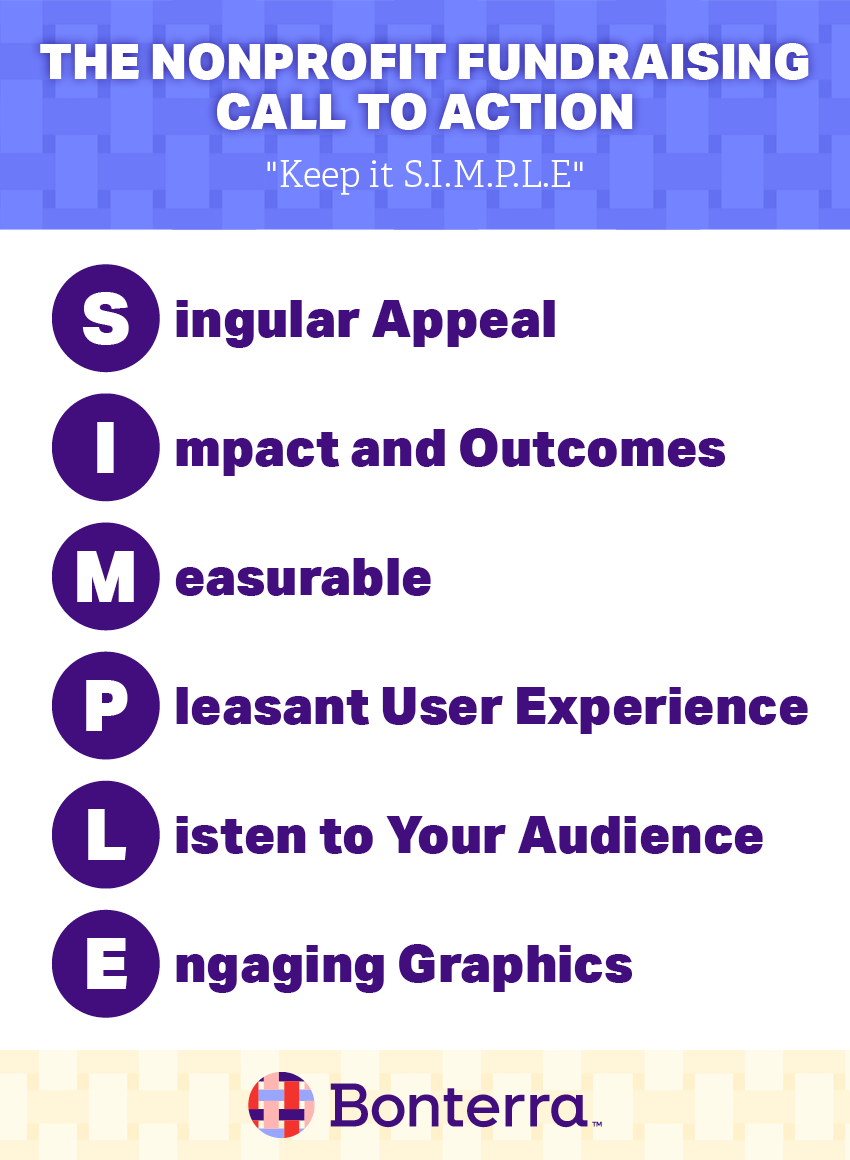
Keep it SIMPLE with this memorable anagram for building your own call to action:

Singular appeal
When you ask for support, keep it singular—ask for supporters to only take one action. This will focus your supporters’ attention without overwhelming them. Keep the request to one program, one action, or one project. If you have multiple projects for which you need support, create multiple calls to action. Then, display them in separate messages.
A single appeal can be as simple as a section on your website, a graphic in a sidebar, or a request or a pop-up image, like this one from TobaccoFreeKids.org.

Impact and outcomes
Give your readers information about how the donation helps your organization and how it will be applied to the community you serve. Tell an impact story or share a statement about what your organization will do with the donation. For example, short statements like these help supporters visualize the outcomes of their donations:
- “A $30 donation provides crayons for one student for an entire year.”
- “A $500 will keep a family’s light or heat on this winter.”
- “Help Create a Tobacco Free Generation.”
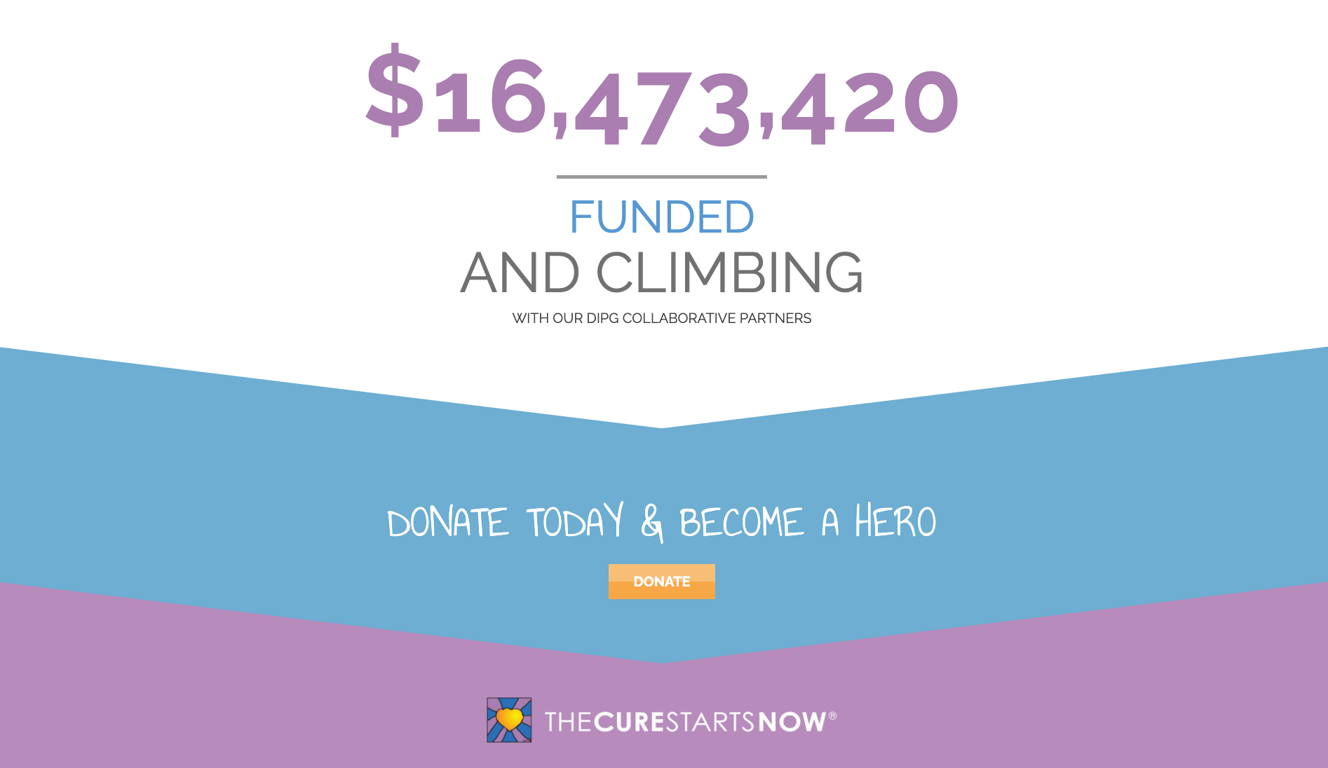
Check out this impact statement from The Cure Starts Now, working to fight pediatric cancer. They show their impact by listing the overall contributions they’ve received as social proof of their success, and the donation button takes visitors to their campaign page to make a gift.

Make It measurable
If you have multiple calls to action on different areas of your site that lead to the same donation page, track which call to actions drive the most visitors to the donate page. Additionally, note if a specific call to action results in higher value gifts.
A simple analytics package like Google Analytics can help you monitor this. Check in every few months, or more often based on activity, to see which one performs the best and make changes to the ones that could be performing better.
Pleasant user experience
The page your calls to action take supporters to should be focused, uncluttered, and move the user to where they can take action quickly. Avoid linking to other pages on your website or external cites as you want to keep supporters on this specific page until they complete the action.
For your donation forms, make sure they’re user-friendly and accessible. Longer forms can be broken down into individual steps. For example, you might ask for contact information in step one, have supporters enter their payment information in step two, and ask optional questions in step three. This can make the donation form seem less imposing while still providing a seamless experience for your users.
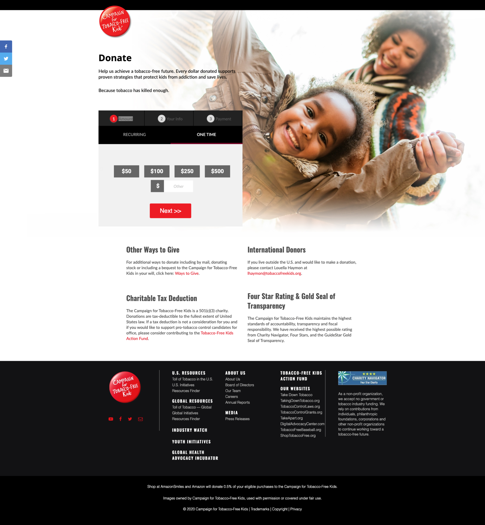
Here’s the donation page from Tobacco Free Kids after following the call to action shown earlier:

In this donation form, there are minimal interruptions. There are no menus and the only links you see on the main part of the page are additional ways to give and a jump over to their action fund which is the political arm of their organization and has an advocacy campaign donate page.
Giving donors the option to choose how their funds are used helps increase your conversion rate and the frequency of donations. Tobacco Free Kids does this well with options for international donors, information about taxes, and information about donating offline too.
Listen to your audience
If you can tap into your audience’s values, you will motivate them to donate more frequently and at higher amounts. Create an audience persona for your supporters to better understand their motives for giving and what types of messages will get their attention.
If you identify multiple motivations, make sure your calls to action focus on appealing to one of them. This will focus your message and cause it to resonate more strongly with its specific audience.
Engaging graphics
Break up your long text appeals with graphics and images that are contextually relevant to your appeal. Feature photos of actual audience members, staff, or the group you have taken yourself. To keep page speeds fast, make sure the images are optimized and consider removing them for mobile visitors.
Even if you’re not an expert graphic designer, a nice image with some text over it can be effective and affordable to make. Here are two fundraising calls to action from the American Bird Conservancy:

The image above shows a call to action on the organization’s homepage and highlights their matching gift program.
The image below is their donate page’s header, which provides additional context to the appeal about where the donated money goes.

Both images are high-resolution graphics with simple text placed over them. These are great calls to action that are easy to add to any website.
Create an effective call to action for your nonprofit
A nonprofit fundraising call to action is an essential component of a modern website and your overall fundraising strategy.
Remember to keep it SIMPLE and follow the steps outlined here to create effective calls to action that will motivate your supporters and help turn them into active and engaged donors and recurring contributors.


