Year after year, online fundraising continues to grow in popularity. For many supporters, your nonprofit organization’s online donation page serves as the last point of engagement before they make a donation. Making a strong, positive impression is key to bringing in valuable contributions.
In this guide, we’ll walk through our top tips for effective donation page design and provide examples of successful nonprofit donation pages to help improve your online fundraising efforts.
5 donation page design tips
1. Focus on your call to action
At the top of your donation page, write a strong call to action that inspires donors to act on behalf of your cause. Make your calls to action more effective with these tips:
- Use active verbs like “support,” “help,” or “change.”
- Keep it concise—it should fit on one line if possible.
- Address supporters directly by using the second person (you/your/yours.)
Once you’ve gotten supporters’ attention, add a few sentences detailing how they’ll help you further your purpose by donating online. Remember that supporters will only read this brief paragraph—and more importantly, scroll down to the donation form—if your call to action is compelling.
2. Streamline user experience
Donors are more likely to complete a donation form that is easy to navigate. Providing a positive user experience also encourages donors to return to the form in the future.
To increase completion rates, streamline your donation form by:
- Including suggested donation amounts. Donors may contribute more if you give them an idea of what size donation would be beneficial to your organization.
- Keeping the form simple. Collect only the information you need for that donation, like the donor’s contact details and payment method, to make giving online as quick and straightforward as possible.
- Making your submission button compelling. Use your submission button’s text as a second call to action (such as “Donate Now!”) and highlight it by using a bold font and contrasting colors.
Also, make sure your donation form is optimized for mobile. Supporters should be able to fill out the form and tap the submission button easily, regardless of whether they’re accessing it from a computer, tablet, or smartphone.
3. Incorporate your organization’s brand
A branded donation page helps establish credibility because it reassures donors that their gifts will go directly to your organization and further your cause. Brand the form to your nonprofit by incorporating your official colors and placing your organization’s logo at the top of the page.
Also, include a photo of your nonprofit at work or of an individual who benefits from your organization’s services (with their permission, of course.) Doing so will give donors a concrete idea of how their contributions make a difference and inspire support.
4. Make payment processing simple and secure
Donors will have a better online giving experience if they can select from several payment options, including all major credit cards, bank account transfers, and mobile payment services. They also need to know that your organization will keep their information safe.
When choosing a payment processor for your online donation page, make sure yours is PCI-compliant or PCI-certified to keep donors’ information as secure as possible. Many payment processors will also send an email or text message verification to donors for increased assurance.
5. Include links across marketing channels
To drive traffic to your donation page, add links or QR codes to it across all of your organization’s marketing materials, including:
- Social media posts
- Donor emails
- Direct mail
- Fundraising flyers
Additionally, make sure supporters can access your donation page while browsing any part of your nonprofit’s website. Adding a call to action button to your site navigation bar will make your donation page stand out and attract more visitors.
Examples of outstanding donation page design
1. Breast Cancer Action

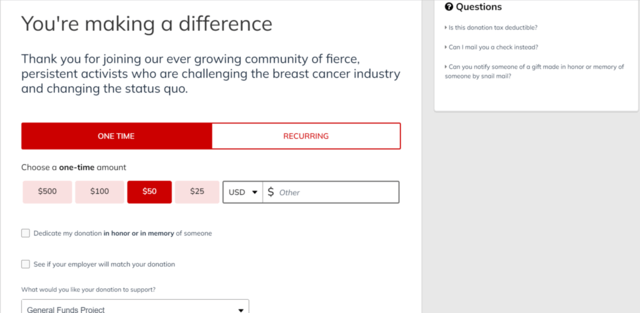
In addition to the suggested contribution amounts and recurring donation button, Breast Cancer Action includes several useful features on its donation page. The basic form fields are supplemented by an FAQ box, several funding designations, and the option to dedicate contributions in honor or in memory of a loved one. Together, these components help reassure donors that their individual gifts are valuable to the organization and its cause.
2. World Wildlife Fund

The most eye-catching element on the World Wildlife Fund donation page is the large photo of a beneficiary of the organization—an elephant. It also uses a cause-centered call to action, “Keep Nature Wild,” and divides the form into three sections to ensure the amount of information doesn’t overwhelm donors.
3. charity: water

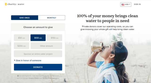
At the top of its donation page, charity: water opted for a longer introductory statement instead of a one-line call to action. However, the sentence “100% of your money brings clean water to people in need” addresses supporters’ concerns about how nonprofits use online donations while still inspiring them to give. The page also has a strategic layout that resizes effectively on mobile devices.
Optimize your donation page to engage supporters
A well-designed donation page sets the tone for your nonprofit’s online presence and helps engage supporters to further your purpose. This tool can help you retain more support by giving donors a positive online donation experience. Look to other organizations for inspiration and invest in flexible fundraising software to maximize your ability to collect donations online.
Ready to Get Started?


