Your annual report is a staple of your nonprofit organization’s annual routine. It’s a powerful tool for communicating your impact, but it’s most useful when structured in an effective and digestible manner. Ultimately, you’ll want to make sure your annual report is coherent, shareable, and engaging for a broad audience that includes not just loyal donors but also new supporters.
To save money, time, and effort while putting together your annual report, we’ve compiled six nonprofit annual report examples to help inspire your organization and get you started. But first, let’s examine the components of an effective annual report.
Annual report essentials
To create an effective annual report, you’ll need to make sure it’s informative, emotionally moving, and empowering. You can create a successful annual report by including some or all of these elements:
- Table of contents
- Your nonprofit’s logo, color scheme, and other branding aspects
- Lots of photos, as well as interactive elements where the format allows
- Your organization’s background and purpose statement
- Easily understandable charts and graphs with relevant data
- Quotes from those you serve and your supporters
- Lists of donors organized by tier
- Highlights from the past year, such as events hosted and goals achieved
- Calls to action
- Financial statements
- A letter from your organization’s president or board chair
While these elements can be a strong starting point, you should customize your annual report to include the information that your current and prospective supporters most want to know. Before drafting your first annual report, make sure to plan with your team and board so you cover all of your desired information.
6 top examples of nonprofit annual reports
Now that you know what goes into an effective annual report, let’s look at how some of these essentials are used in practice. Here are six of the best nonprofit annual reports that your organization can look to for inspiration.
1. Pathfinder International
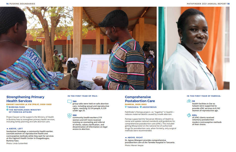
Pathfinder International’s annual report combines thoughtful design, powerful graphics, individual stories, and gorgeous portraits to vividly showcase its beneficiaries. While the organization uses visually appealing graphics to highlight key data points, it never overshadows the focal point of the report: the people it serves.
One section that stands out is titled “Pathfinder’s Global Impact,” which communicates how the organization has strengthened primary health services in the wake of COVID-19. Additionally, it details how its post-abortion care program in Tanzania has improved health facilities across the region. Each page combines clean data visualization and concise, bulleted information on how Pathfinder made an impact, while still giving the spotlight to the individuals the nonprofit served.
2. The WNET Group
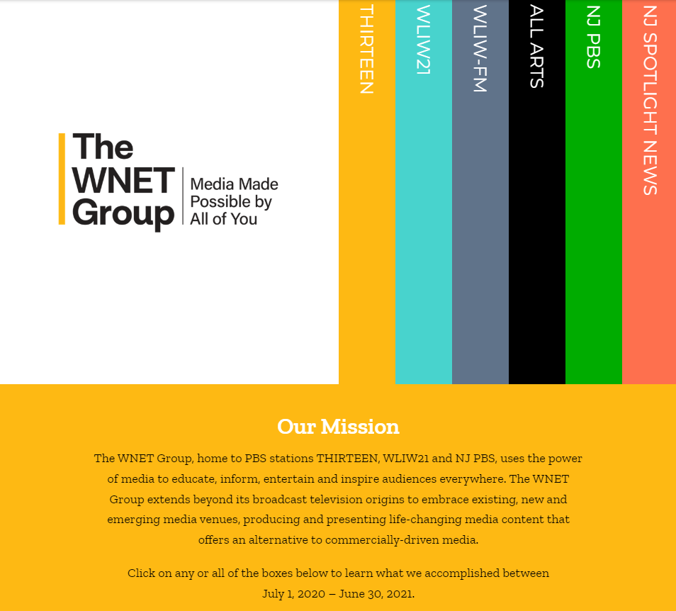
While many nonprofits present their annual reports in a static PDF or print format, adding interactive elements can take yours to the next level. For instance, The WNET Group’s “Year In Review” series allows for audience interaction in its web design to create a dynamic story. The user can expand the information they’re interested in learning more about, making them more likely to absorb the information.
3. The Humane Society
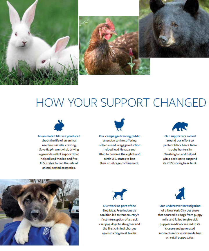
Keeping with the organization’s purpose to save animals in need, the Humane Society’s annual report includes ethical and effective appeals to emotion on every page. Including photos of a wide range of animals demonstrates how its programs benefit hundreds of species across the country. Readers will likely see their favorite animals featured, which helps them connect more deeply with the Humane Society.
Besides the impactful graphics, the organization provides clear and concise information about the progress it has made in the U.S. and internationally alongside compelling copy and analytics. Throughout the report, the focus remains on beneficiaries while still highlighting the organization’s important updates.
4. The American Kidney Fund
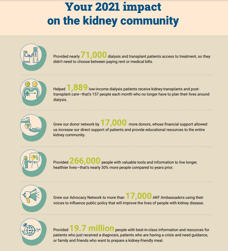
The American Kidney Fund features eye-catching graphic design, but what it does best is center the donor’s impact. The impact summary page speaks directly to supporters and gives them credit for furthering the organization’s purpose. It also summarizes the year’s metrics and milestones by combining colorful illustrations and bolded statistics. The American Kidney Fund’s annual report offers donors valuable reasons to give again in the future while presenting impressive impact statistics.
5. Broadway Cares
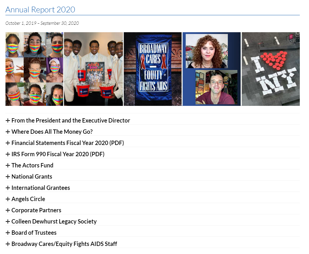
Broadway Cares demonstrates the importance of consistency while creating annual reports. To boost user-friendliness, readers should be able to easily access the information they’re looking for. By hosting the information directly on the organization’s website, without downloads and with a convenient drop-down menu selection, supporters can track their impact over the years, no matter how long they’ve been donating.
6. Brookings Institution
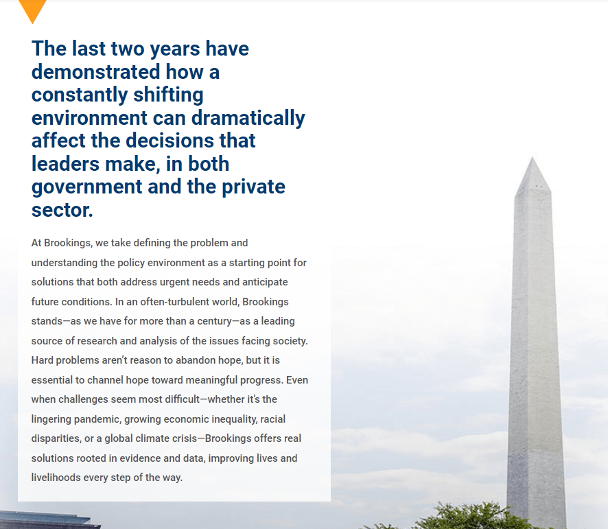
The Brookings Institution annual report is comprehensive. It weaves a consistent narrative throughout the report, combining nonprofit storytelling with data-informed impact. Brookings also contextualizes the report in terms of those years’ notable current events. This highlights how they remained committed to producing real-time, thoughtful analysis and practical policy recommendations during a challenging time.
A final note about nonprofit annual reports
While there are some elements that remain consistent across annual reports, your overall report should be unique to your nonprofit. As you write, ensure your supporters can identify your organization’s purpose and values, as well as how you’re making an impact. Through consistent branding and content structured around your accomplishments, your organization can make your annual report an effective and inspiring tool for connecting with existing and future supporters.


