Your website is essential to your nonprofit organization’s success. When potential supporters first discover your nonprofit, they’ll likely go to your website to learn more about your purpose and impact. More than that, it’s a key tool to engage your current supporters, promote volunteer opportunities, register event participants, and drive donations.
To make the most of your nonprofit website, you’ll need it to stand out from the crowd. Start designing a nonprofit website that leaves a lasting impression with these seven tips.


 Interactive elements prompt supporters to spend more time exploring your website, which makes them more likely to take action. They also leave a longer-lasting impression than text or still images alone.

1. Center your purpose
Your organization’s purpose is at the heart of everything you do, so it should also be at the heart of your website. Feature your cause prominently on your site’s homepage, and create a dedicated about page where supporters can learn everything they need to know about your organization’s work before getting involved. Additionally, make sure your purpose is clear on every page of your website. Including a variety of photos, videos, case studies, infographics, and other media that reflect your cause reminds donors why your organization is worth supporting, no matter where they are on your website. To look at an example, the Humane Society makes their purpose clear from the second supporters land on their website and includes media that points back to their cause on a variety of pages, like this “How You Can Help” page.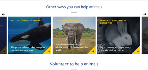
2. Keep your branding consistent
You’re probably familiar with the term “branding” as it relates to the way for-profit companies market their products and services. But branding is just as important for nonprofits. Even though you aren’t selling a product in the traditional sense, you’re still selling something just as valuable: your impact. Branding allows supporters to recognize your organization immediately and makes your marketing materials—especially your website—more memorable. When you design your website, make sure to include these key branding elements:- A simple but memorable logo
- Specific font choices, color palettes, and image styles
- A distinctive voice in your messages that reflects how you want supporters to perceive your organization
3. Focus on your donation page
Your website is also a valuable fundraising tool. Make it easy for your supporters to donate online by:- Limiting the number of form fields on your donation page
- Offering suggested donation amounts and the ability to set up recurring contributions
- Ensuring your payment processing is secure
- Linking to your donation form on every page of your website
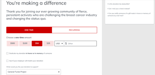
4. Offer multiple engagement opportunities
In addition to driving donations, your website can help supporters engage with your nonprofit in other ways. Feature a variety of opportunities to get involved, such as:- Volunteer sign-ups
- Event registration
- Advocacy opportunities
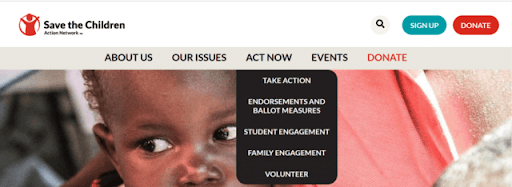
5. Incorporate interactive media
You’ve likely heard the saying, “A picture is worth a thousand words,” and it’s especially true in web design. Using engaging visuals on your website can help supporters understand your organization’s purpose and inspire them to get involved. To take your web design to the next level, include not only still images but also other interactive media such as videos, clickable maps, and image carousels, like the example below from WWF Canada’s Living Planet Technology Hub.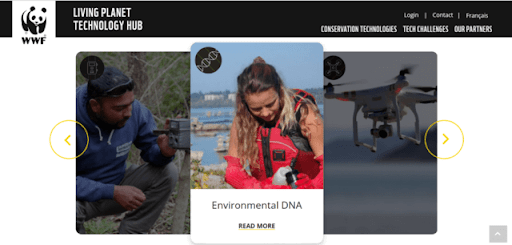 Interactive elements prompt supporters to spend more time exploring your website, which makes them more likely to take action. They also leave a longer-lasting impression than text or still images alone.
6. Optimize for mobile
Keep in mind that many of your supporters will access your website on their phones or tablets rather than with a computer. More than 60% of internet users view websites on mobile devices, and that number is only expected to grow in the coming years. Optimize your website for mobile using these strategies:- Use a website builder with a responsive design framework, meaning it automatically resizes content based on the size of the screen.
- Keep page layouts vertical to reduce the need for scrolling.
- Ensure fonts are at least 16px in size and buttons are large enough that users can easily tap them on a touch screen.
7. Connect your website to your other marketing materials
Your website is the core of your nonprofit’s marketing strategy. However, marketing across multiple platforms will help you spread the word about your organization more effectively. Get supporters’ attention with other marketing materials, then direct them to your website to learn more and take action. Include links back to your website in both digital and print communications, such as:- Email marketing
- Social media posts
- Direct mail
- Fundraising flyers
Prioritize your nonprofit’s website design
Your nonprofit’s website touches many essential operations at your organization, from fundraising to attracting new supporters to building lasting relationships. Design your website to reflect your organization’s purpose, then use your other marketing materials to direct supporters to the site to learn more and take action.
Ready to Get Started?
Don't miss out
Get the latest insights delivered to your inbox.


