Your nonprofit organization’s website is a key element of your digital marketing strategy. It provides countless opportunities to engage your audience through event and volunteer registrations, newsletter subscription boxes, and online donation opportunities. Your website also serves as a hub of information for supporters and stakeholders who want to learn more about your organization’s work.
To fulfill this last purpose, your website needs to have a well-designed About page. Sometimes called the purpose page,
your About page provides a snapshot of your organization: who you are, what you do, and what you believe.
In this guide, you’ll learn everything you need to know to design a standout nonprofit About page that showcases your
organization’s strengths and encourages visitors to take action. Let’s dive in!
Essential elements of a nonprofit About page
More than anything, your About page should represent your organization’s unique strengths and accomplishments. While putting this into action will look different for every nonprofit, About pages should generally include the following six elements.
1. Statement of purpose
Your nonprofit’s statement of purpose is the driving force behind all of your activities and accomplishments. Therefore, it should stand out on your About page and inform the rest of your online content.
Write out your statement of purpose near the top of your About page, highlighting it in bold text on a contrasting background. If the statement is longer than a sentence or two, summarize the most important elements at the top to draw readers in and write out the full statement further down the page.
2. Relevant visuals
One of the best ways to illustrate your statement of purpose is by pairing it with visuals related to your organization’s impact. Images and other media help make your purpose more concrete and inspire visitors to get involved. For example, you could include:
- Photos of your beneficiaries or of your volunteers at work (with their permission, of course).
- A short video in which a loyal supporter or leader at your organization explains your nonprofit’s purpose and work.
- Infographics that showcase your organization’s key successes.
Also, as with the rest of your website design, make sure to include your nonprofit’s branding on your About page. Seeing your organization’s logo, color scheme, and other brand elements helps build a sense of trust with your audience.
3. Team member information
Furthering your purpose is only possible because of the team behind your nonprofit. So, your About page is a great place to introduce your staff, showcasing the skills and experience they bring to their work.
It’s okay to place this information on a page separate from your About page if your team is large—just make sure website visitors can easily navigate to it. If you work in a field where privacy may be an issue (such as domestic violence service delivery), you may choose not to publish your staff members’ names and photos, but make sure to highlight the relevant experience your team brings to the table.
4. Impact statements
Although it’s best to create a separate impact page to more effectively emphasize your nonprofit’s accomplishments on your website, including a few brief statements of impact on your About page can further illustrate your purpose. Then, add a link to your impact page so that your readers can take a deeper dive.
Your impact statements should make explicit the cause your organization is working to address. Express this using statistics or graphics with a few lines of explanatory text to give visitors an overview of your high-level impacts.
5. Contact information
Give supporters who want to learn even more about your organization the chance to do so straight from your About page by including some key contact information. This could take a few different forms, including:
- Adding your nonprofit’s phone number and generic email address to the footer.
- Linking to a contact page elsewhere on your website.
- Placing social media icons on the page to take supporters to your most-used profiles.
Some organizations also include a running feed of their latest tweets or Instagram photos on the far right side of their About page. If your organization is particularly active on one of these platforms, this strategy can give supporters an idea of what to expect if they choose to follow your organization’s account.
6. Calls to action
If a website visitor makes it to the end of your About page, there is a good chance they’re interested in getting more involved with your organization’s purpose and work. Make it easy for them by adding a call to action to the end of the page, such as:
- A subscription box to join your email list.
- A “Give Now” button linking to your online donation page.
- A calendar displaying upcoming events and volunteer opportunities with links to sign-up forms for each one.
- Other calls to action specific to your purpose (for example, an animal shelter might add links to pages where visitors can view adoptable dogs and cats).
In many cases, it’s a good idea to include more than one of these calls to action. Each visitor may be at a different level of the nonprofit ladder of engagement, so give them the option to take a next step they’re comfortable with considering their previous experience with your organization.
Examples of outstanding nonprofit About pages
Now that you know what goes into a nonprofit About page, let’s look at three examples of outstanding pages to inspire your organization’s design.
1. Humane Society

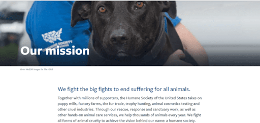
The Humane Society makes its purpose clear as soon as visitors land on the website’s About page. They begin with a bolded one-sentence statement of their purpose to grab the reader’s attention, then explain their work in a few sentences below that statement. The page also features a photo of a dog in a volunteer’s arms to reinforce the Humane Society’s work to end suffering for all animals.
2. Campaign for Tobacco-Free Kids

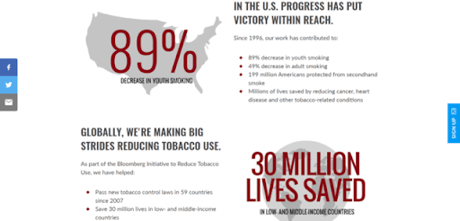
The Campaign for Tobacco-Free Kids focuses heavily on impact statements on its About page, an effective strategy for an advocacy organization. The page categorizes the nonprofit’s impacts by initiative and uses graphics to highlight one major statistic per section so visitors can get a sense of the organization’s many accomplishments.
3. Girl Scouts of the USA

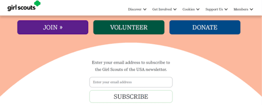
The section of the Girl Scouts of the USA’s About page that really stands out is the calls to action. Their website receives visits from a variety of audiences, including families of prospective Girl Scouts, past Girl Scouts who want to stay involved, and individuals who just want to purchase cookies. The site’s About page provides next steps for each of these audiences, as visitors can either join the program, volunteer, donate, or sign up for the nonprofit’s newsletter to stay informed about cookie sales and other events.
Prioritize your nonprofit’s About page
Your nonprofit About page or purpose page is one of the most critical pages on your site for engaging supporters, so design it with care. You can look to other organizations for inspiration, but ultimately, your page should reflect what makes your nonprofit unique.


